

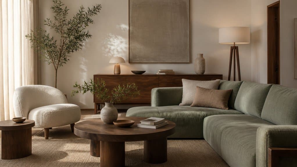
A cohesive home starts with a few deliberate choices, not a matching set in every room. Choose a colour palette you can carry from space to space, then use texture and lighting to keep it from feeling flat. Balance bold accents with calming neutrals, and mix soft fabrics with smoother finishes. The right layers can make your home feel connected from morning to evening—but small missteps can disrupt that balance.
Choose a Colour Palette for a Cohesive Home
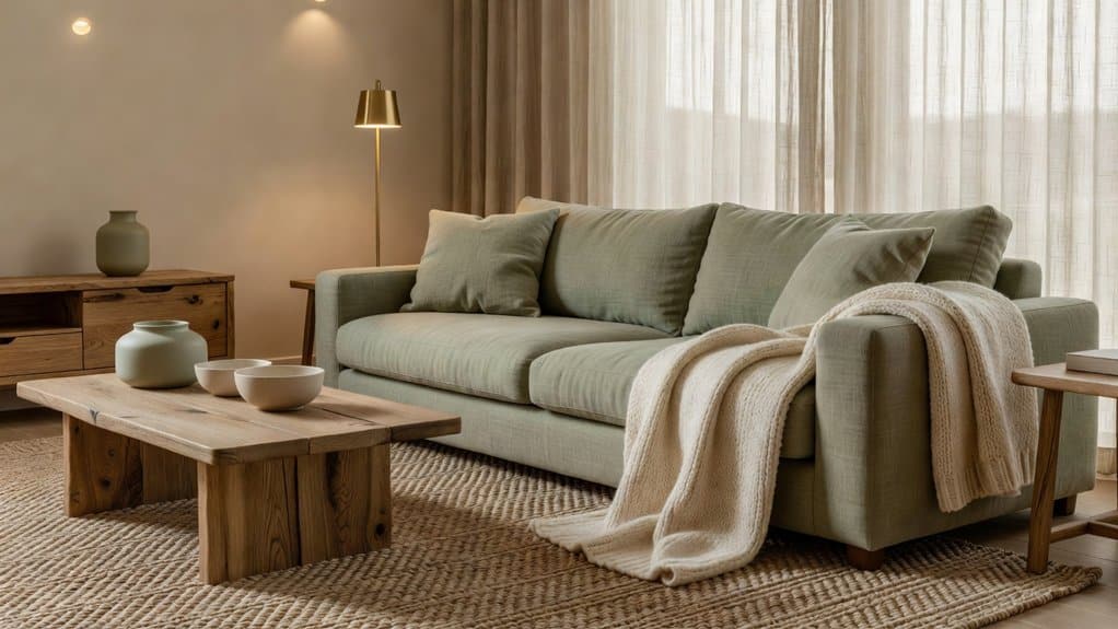
Choose a consistent colour palette to create a sense of flow from room to room. Begin by selecting three or four colours that suit your home’s light, architecture, and furnishings.
Use one dominant neutral for large surfaces, such as walls or flooring, then add a secondary shade and one or two accents.
Check paint samples at different times of day; natural and artificial light can shift their appearance.
Color harmony doesn’t require matching every item. Instead, balance warm and cool undertones, and repeat selected shades in fabrics, artwork, or accessories.
Add Texture contrast to keep a restrained palette from feeling flat: pair smooth painted walls with woven upholstery, matte ceramics, or natural wood.
Before buying, test combinations together and remove colours that compete. This gives you a clear, workable foundation for decorating decisions.
Carry Your Colours From Room to Room
Carry your chosen palette through the home, adjusting its balance to suit each room.
Repeat accent colours in details such as cushions, artwork, or trim to create clear visual links.
Use neutrals in connecting spaces to ease shifts between stronger colours.
Choose a Consistent Palette
A consistent colour palette connects rooms without making them feel identical. Choose three or four colours to guide your home: a dominant neutral, a supporting shade and one or two complementary tones. Use these colours across adjoining spaces, adjusting their proportions to suit each room’s light, function and furnishings.
Consider Color psychology when selecting hues. Soft greens can feel restful in a bedroom, while warmer tones may bring energy to a kitchen or dining area. Check how each shade looks in natural and artificial light before committing; paint samples on different walls and view them throughout the day.
Cultural symbolism also shapes how colours feel, so choose shades that reflect your preferences and the atmosphere you want. Record your palette with paint names and finishes, then use it to make confident choices as you furnish each room.
Repeat Accent Colours
Repeat one or two accent colours in adjoining rooms to create a visual thread without making the spaces feel uniform. You can carry a muted blue from the living room into the hall through a cushion, artwork, or a painted cabinet.
In the kitchen, echo that blue in a small vase or patterned tea towel rather than repeating every detail. This measured Accent colour repetition helps your home feel connected while letting each room keep its own character.
Use colour coordination techniques to vary the shade, scale, and placement: choose a deeper tone for a larger feature and a softer tint for a small accessory. Check colours in daylight and evening light before committing, since lighting can shift their appearance.
Keep accents intentional, and edit pieces that compete for attention.
Connect Rooms With Neutrals
Neutrals can link adjoining rooms while giving each accent colour room to stand out. Choose Neutral wall shades, such as warm white, soft greige or muted taupe, and repeat them across connected spaces. Consistent undertones matter: pair warm neutrals with warm wood and creamy fabrics, or cool neutrals with crisp whites and brushed metal.
This continuity helps your eye move naturally from one room to the next without making every space feel identical.
Carry colour between rooms through subtle decor accents. Repeat a cushion’s blue in a hallway print, or echo a terracotta detail in a nearby vase. Keep these touches small and intentional, then vary their placement and scale.
Test paint samples in each room’s daylight and evening light; the same neutral can shift noticeably. You’ll create a connected home with distinct, balanced rooms.
Balance Bold Colours With Calming Neutrals
Anchor bold hues with calming neutrals so your strongest colours feel intentional, not overwhelming. Repeat those colours sparingly across rooms to create continuity without visual clutter.
Use textured fabrics, rugs, or natural materials to soften sharp contrasts.
Anchor Bold Hues With Neutrals
When you introduce a bold hue, pair it with calming neutrals to keep the room balanced. Use neutral backgrounds on walls, floors, or larger furnishings, then let a saturated colour bring focus through a sofa, rug, or artwork. This contrast gives your eye a place to rest while preserving the room’s character.
Choose neutrals that suit the hue’s undertone. Warm terracotta and mustard sit comfortably with cream, beige, or warm wood. Cobalt and emerald often feel sharper beside cool grey, crisp white, or stone. Test paint and fabric samples in morning and evening light before committing, since lighting can shift how colours read.
Keep bold accents to a manageable scale, and use texture—linen, wool, or matte ceramics—to add depth without introducing another competing colour.
Repeat Colours With Restraint
Repeat a bold colour in two or three smaller details, such as a cushion, lamp base, and artwork, to make the room feel connected without letting the hue dominate. Keep larger surfaces, such as walls and sofas, in calming neutrals so those accents remain intentional.
Choose one shade and vary its placement rather than adding several competing hues. In monochromatic schemes, repeat different tones of the same colour to create a clear visual link.
If you prefer colour blocking, limit the palette to a few defined areas and echo one block in a smaller accessory.
Step back and check whether your eye moves naturally around the room. If one accent draws too much attention, reduce its size or shift it to a less prominent position. This keeps the overall palette balanced.
Soften Contrast With Texture
Once you’ve repeated a bold colour in a few details, use texture and calming neutrals to keep it from overpowering the room. Balance saturated accents with warm white, soft grey, or muted beige across larger surfaces, such as walls, rugs, and upholstery.
Then add textural contrast: pair a smooth painted wall with nubby linen, a velvet cushion with a woven throw, or sleek furniture with a natural-fibre rug. These shifts create depth without introducing more competing colours.
Choose materials that suit how you use the room; washable cotton works well in busy spaces, while delicate wool may fit a quieter sitting area. Aim for tactile variety, but limit patterns and finishes so each texture remains distinct.
Step back and check that neutral surfaces still connect the bold accents throughout the room.
Layer Textures to Add Warmth and Depth
Layering textures gives a room warmth and depth without adding more color or pattern. Start with a substantial base, such as a wool rug or linen curtains, then add lighter elements that invite touch.
Layered textiles work best when you vary their weight and weave: pair a chunky knit throw with smooth cotton cushions, or place a soft rug over a firm floor. These tactile surfaces create contrast your eye can read and your hands can feel.
Balance rough and smooth materials across the room rather than grouping every texture in one spot. A woven basket beside a polished stone surface, for example, adds dimension without visual clutter.
Keep the palette restrained, and let texture do the work. If a combination feels busy, remove one layer; each piece should contribute comfort, structure, or depth.
Match Finishes, Furniture and Fabrics
To make finishes, furniture, and fabrics feel cohesive, repeat a few shared tones or materials throughout the room. Choose two or three finishes, such as brushed brass, dark wood, and matte black, then distribute them across hardware, frames, and furniture details.
Matching finishes doesn’t mean making every piece identical; use contrast deliberately, and repeat each finish at least twice so it feels intentional. Let your largest furniture pieces establish the palette, then connect them with smaller accents.
When coordinating fabrics, repeat a colour in different patterns, scales, or textures—for example, pair a solid cushion with a striped throw and a patterned chair. Keep undertones consistent, especially in whites, woods, and metals.
Before buying, compare samples beside your existing pieces in the room, and remove any finish or fabric that competes without adding purpose.
Use Lighting to Create a Consistent Mood
Lighting can reinforce the palette you’ve established while making the room feel comfortable at different times of day. Start with ambient lighting that spreads an even glow, then add task lights where you read, cook, or work.
Choose warm or cool bulbs to suit the mood you want, and check their colour temperature against your room’s existing finishes. Install dimmers so you can lower brightness in the evening without leaving corners unlit.
Position lamps to soften harsh contrasts, and use directional fixtures for controlled shadow play on walls or ceilings. Keep bulb types consistent within a room to avoid uneven colour and brightness.
Before settling on a layout, test each light after dark and during daylight. Adjust placement or output until you can move comfortably and complete everyday tasks without glare.
Pull Colour, Texture and Light Together
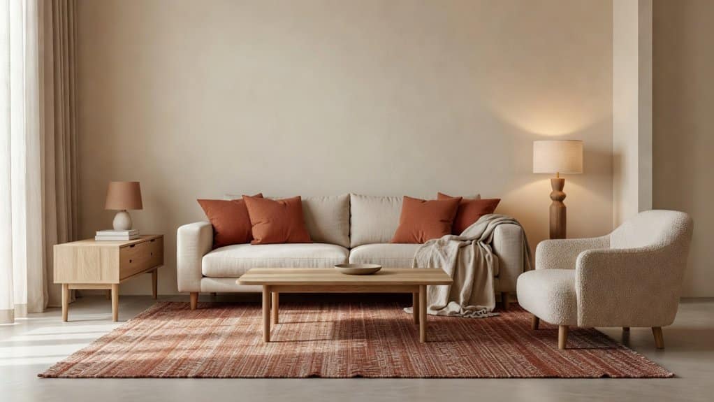
Once you’ve chosen your palette, finishes and fixtures, check how they work together across the room. Harmonizing colour schemes means balancing warm and cool tones, then repeating key colours in upholstery, artwork and smaller accents. Keep the distribution deliberate: a dominant shade should anchor the space, while supporting hues add contrast without competing.
When integrating diverse textures, pair smooth surfaces with tactile materials such as linen, timber, wool or brushed metal. Vary texture to create depth, but repeat at least one finish or material so the mix feels connected.
Next, assess the lighting at different times of day. Natural light can shift how colours appear, while bulbs may warm or flatten them. Test samples in place, and adjust lamp positions or bulb temperature. Your choices should reinforce one another, creating a room that feels balanced, comfortable and cohesive.
Frequently Asked Questions
How Can I Make a Small Home Feel More Spacious?
You can make a small home feel more spacious by clearing clutter, choosing multifunctional furniture, and keeping walkways open.
Use Space optimization strategies, such as wall-mounted shelves, storage under beds, and foldable tables, to free valuable floor area.
Create Color illusions with light, consistent shades on walls and ceilings; mirrors can reflect daylight and visually extend a room.
Hang curtains near the ceiling, use slim furniture, and layer lighting to brighten corners without overcrowding them.
What Are the Best Ways to Decorate a Rental Without Permanent Changes?
Treat your rental like a blank canvas: use Temporary decor to add personality without risking your deposit. Hang art with removable hooks, apply peel-and-stick wallpaper or tiles, and layer rugs to define spaces.
Choose Removable accents, such as cushion covers, lampshades, and window treatments, to introduce colour and texture.
Rearrange furniture, add plants, and use freestanding shelves for storage.
Before making changes, check your lease and test adhesives in an inconspicuous spot.
How Can I Choose Artwork That Suits My Interior?
Choose artwork that reflects your taste while complementing your room’s scale, palette, and mood.
For strong Color coordination, echo one or two existing shades in the piece, or use contrasting hues as a deliberate focal point.
Match the artwork’s visual weight to the wall and furniture; large walls often suit larger works or balanced groupings.
Consider texture and framing, too.
Artistic expression matters, so select pieces you’ll enjoy seeing every day.
Test placement before hanging.
How Often Should I Update My Home Décor?
You don’t need to overhaul your home décor on a strict schedule; refresh it whenever your needs, tastes, or routines change. Let sunlight shift across the room as you swap cushions, throws, or artwork for seasonal decorating.
Try color psychology to choose shades that support the mood you want, such as calming blues in a bedroom.
Review each room yearly, keep what works, and update a few details rather than replacing everything.
What Are Easy Ways to Make a Home More Child-Friendly?
Make your home more child-friendly by securing furniture to walls, covering sharp corners, and installing safety gates where needed.
Choose Safe materials, such as washable, low-VOC paints and non-toxic finishes, for surfaces children touch often.
Add Creative storage with low baskets, labelled bins, and sturdy shelves so kids can reach toys and put them away.
Keep walkways clear, anchor rugs with non-slip pads, and store medicines, cleaning products, and small choking hazards out of reach.
Leave a Reply